
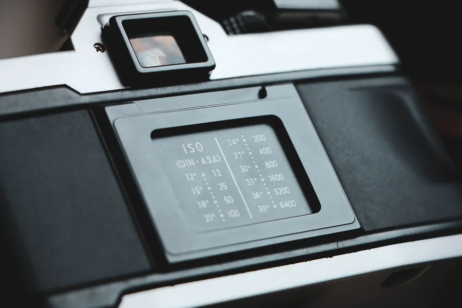
If you are trying to recreate the nostalgic feel of family photos from the 1980s or 1990s, you have likely looked for a photo time stamp font. That glowing orange or red date in the bottom corner of old prints is a classic hallmark of analog photography that many digital designers want to copy today.
In this guide, we discuss the history of these camera dates, the best free digital fonts to use, and how to apply them to your images. Recreating old design styles requires paying close attention to details, much like choosing materials when picking a style option for your wardrobe. If you want to configure your creative workspace, check our guidelines on maintaining software configurations for better performance.
Table of Contents
What is the classic photo time stamp font?
The classic photo time stamp font is not a single digital typeface, but rather a seven-segment digital display style produced by physical camera hardware. These numbers were formed by quartz date backs, which used tiny light-emitting diodes to burn the date directly onto the film backing during exposure.

From what we’ve seen in retro design templates, getting the look right depends on selecting a font that mimics these blocky, segmented lines. According to camera history archives, date backs became popular in the early 1980s, allowing families to document the exact day and year their memories were captured.
One myth many designers believe is that any digital or dot-matrix font will look authentic on their photos. In fact, standard digital fonts are often too clean and sharp, lacking the slight light bleed and fuzzy edges that occurred when the camera’s internal lights exposed the physical film.
Top digital fonts to recreate the retro camera look
The top digital fonts to recreate the retro camera look are DSEG, Digital-7, and DS-Digital. These free-to-download fonts are designed to copy the look of liquid crystal displays and seven-segment hardware modules.
Here are three popular fonts for vintage overlays:
- DSEG: A highly accurate font family that offers multiple segment styles, including classic clock digits and seven-segment blocks.
- Digital-7: A simple, clean segmented font that is perfect for mimicking the dates seen on 1990s point-and-shoot cameras.
- DS-Digital: A slightly italicized digital display font that works well for recreating dashboard or camcorder date stamps.
In practice, utilizing these specialized typefaces is much better than trying to draw the numbers manually. If you are editing photos on your phone, you can search for apps that offer these fonts directly inside the editing tools on mobile systems.
How to add a retro date stamp to your photos
To add a retro date stamp to your photos, download a seven-segment font, type the date in the bottom-right corner of your image, color the text warm orange, and apply a subtle outer glow filter. This process creates the illusion of light burning through the film.

We prefer using the hex code #FF6600 or #FF8800 for the text color because these specific shades of orange and amber match the light wavelength of quartz date diodes. According to digital design guides, applying a Gaussian blur filter of less than one pixel to the date layer helps simulate the natural softening that occurred during printing.
Imagine you are preparing a photo album for a vintage-themed website. Using the correct font style, a bright orange color, and a tiny bit of blur will make your modern smartphone pictures look like they were taken with a 35mm camera thirty years ago.
Important tips for authentic retro timestamps
Important tips for authentic retro timestamps include positioning the text in the lower-right corner, keeping the font size relatively small, and matching the format to the specific decade. For example, 1980s cameras often used a two-digit year format separated by dashes.
Here is an important warning based on common graphic design errors: do not make the date stamp perfectly sharp or pure orange, as this immediately ruins the analog illusion. One mistake we see beginners make is placing the date on top of bright white backgrounds where it becomes hard to read, which never happened on real film prints because the light exposure required a darker area to show up. For tips on how to prepare images of home projects or glass repairs, review our guidelines on glass window setups to keep your photos clear.
Frequently Asked Questions about Photo Time Stamps
What color is the classic camera date stamp?
The classic camera date stamp is almost always a warm orange, amber, or light red. These colors were used because red and orange LEDs were cheap to produce and did not overexpose the surrounding film during printing.
Is there a default timestamp font in Photoshop?
No, Photoshop does not include a default seven-segment font. You must download a free font like DSEG or Digital-7 from a trusted online directory and install it on your operating system first.
Can you automate timestamps on mobile photos?
Yes, there are several mobile applications available that automatically add a customizable retro date stamp to your photos as you take them. You can adjust the size, color, and format of the numbers in the app settings.

Written by Rosella
Rosella is a self-taught digital creator with a passion for breaking down tech, lifestyle, and everyday topics into simple, easy-to-understand content. Based in Youngstown, Ohio, she brings a curious, multi-disciplinary approach to writing, covering everything from the latest tech trends to practical life hacks and personal growth insights.
Her goal is straightforward: take complicated ideas and explain them in a way that actually makes sense, so every reader, whether a total beginner or someone more experienced, walks away having learned something useful. When she’s not writing, you’ll usually find her exploring new tools, sharpening her skills, or spending time with family.
Through this blog, Rosella aims to build a community centered on real, actionable insights rather than fluff, jargon, or filler content.